Inventory Chart and Item Sales Chart
Lifecycle Curve Chart and Lifecycle Curve (Aggregated) Chart
On the right-hand side of the Lifecycle Planning Worksheet, there are Value Charts with information related to the worksheet lines.
Inventory Chart and Item Sales Chart
The Inventory Chart and Item Sales Chart display the item’s inventory movement and sales development within a period for the selected worksheet lines. The starting date of the charts is defined according to the following criteria:
- The item’s Lifecycle Starting Date, if selected on the
- The selected season’s Starting Date, if selected and the property in case 1 is not set.
- The beginning of 12 weeks from TODAY, if the properties in case 1 and 2 are not set.
Inventory Chart
In the Inventory Chart the inventory values are calculated over the time period from the beginning as described above and until the current day.
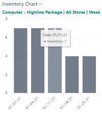
The item sales that have not been included in a posted statement are not included in the chart quantities.
There are three options for the Period Length: Day, Week, and Month. The default value for the chart is Week. The chart columns represent the inventory value over the selected period. The X-axis value represents the beginning of the period. That is, as shown in the image, the period selected is Week, then the column for 01/11/21 represents the cumulative change in inventory over the week 01/11/21 to 01/17/21.
Note: The first column in the image does not represent a whole week. This is because that season does not start on a Monday. It starts on Friday 01/01/21, hence the first column represents the week part from the beginning of the season until the beginning of the first whole week of the season.
When you click Refresh in the chart menu, the values will be displayed for the default Period Length, namely Week.
Item Sales Chart
In the Item Sales Chart, the sales quantities are calculated over the same time period as displayed in the Inventory Chart.
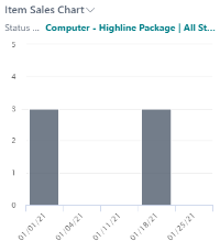
The sales values include sales that are included in statements that have not been posted. All chart properties are the same for the Item Sales Chart and the Inventory Chart. That is, the functions for Period Length and Refresh work the same. Week is the default Period Length value, and the first column does not necessarily represent a whole week.
Lifecycle Curve Chart and Lifecycle Curve (Aggregated) Chart
The Lifecycle Curve Chart and Lifecycle Curve (Aggregated) Chart describe a product's sales behavior or sales pattern. For new products with insufficient historical sales data to work with, the lifecycle curve concept uses the historical sales data from previous or similar products to forecast the new product's estimated demand.
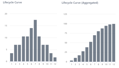
For more details on Lifecycle Curve see Lifecycle Curve.
See also
How to: Set Up a Lifecycle Planning Worksheet
How to: Populate the Lifecycle Planning Worksheet